case study —
WE: WorkEase
Designing a calmer way to organize your day
Role
UI Designer
Platform
Mobile Application
Timeline
UI Design Exploration · solo
Status
Completed
Tool
Figma
Overview
WorkEase is a productivity app concept focused on helping users organize tasks, habits, and daily schedules through a clean and structured mobile interface.
The project was created as a UI design exploration to practice dashboard layouts, calendar interactions, task organization, and visual consistency across multiple screens.
Objective
I wanted to explore how productivity information such as tasks, habits, and schedules could be organized into a simple and easy-to-scan mobile experience.
The focus was on creating an interface that felt calm, organized, and approachable rather than overloaded with information.
My Role
As the designer, I:
- Designed the complete mobile interface
- Explored onboarding and authentication screens
- Created dashboard and scheduling layouts
- Designed task and habit management screens
- Practiced visual hierarchy, spacing, and consistency across screens
Design Decisions
1. Calendar-Centered Planning
The dashboard was built around a calendar view, allowing users to quickly switch dates and view schedules.
Most productivity activities are time-based. Keeping the calendar visible helps users understand both what needs to be done and when it needs to be completed.
2. Separate Tasks and Habits
Tasks and habits were displayed as separate sections within the dashboard.
Tasks are usually one-time actions, while habits are recurring activities. Separating them makes the interface easier to understand and scan.
3. Minimal & Calm Visual Design
I used a simple blue-and-neutral color palette, spacious layouts, and card-based sections throughout the interface.
Productivity tools should help users focus, not overwhelm them. A minimal visual style reduces clutter and keeps attention on important information.
UI Direction
Design Principles
- Simplicity over complexity
- Clarity over decoration
- Consistency across screens
Visual Style
- Soft blue accent color
- Clean card-based layouts
- Spacious spacing and padding
- Lightweight, minimal interface
- Mobile-first design
Key Learnings
- Spacing and hierarchy can significantly improve readability.
- Consistent layouts make interfaces feel easier to navigate.
- Limiting colors helps important actions stand out naturally.
- Even simple productivity interfaces require careful organization of information.
Next Steps
Improve Habit Tracking
Add streak tracking and progress insights to make long-term habits more engaging.
Why
Users stay motivated when they can clearly see progress over time.
A quick walk through the interface.
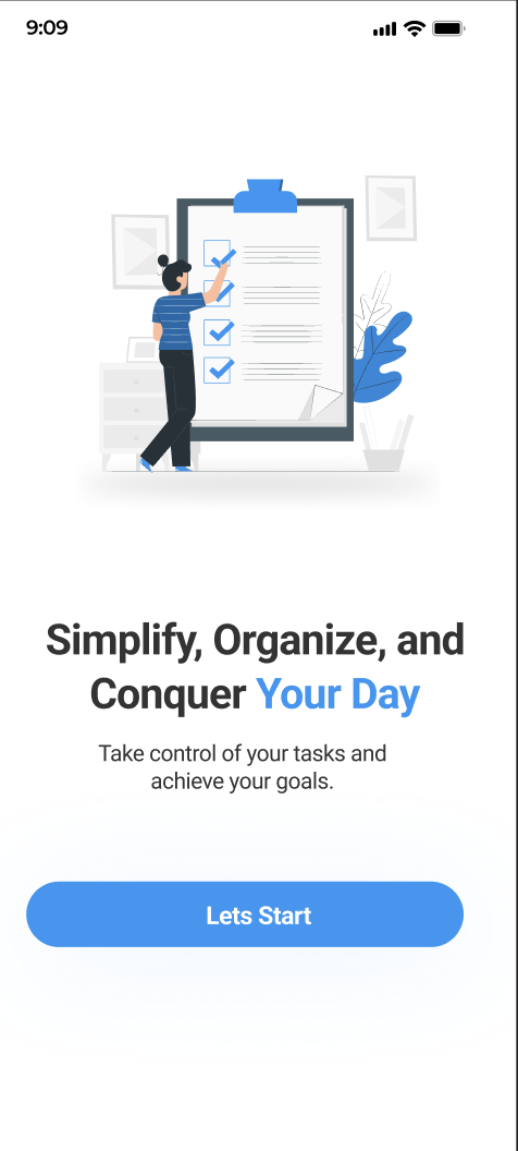
Onboarding
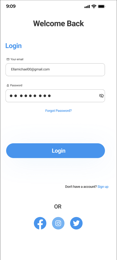
Sign In
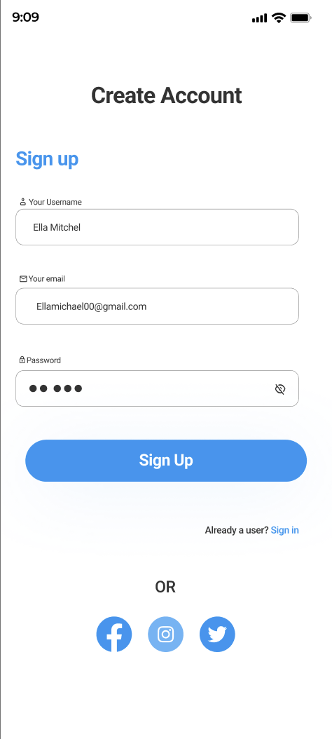
Sign Up
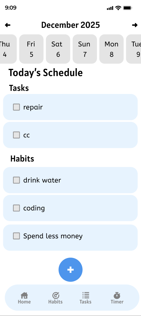
Dashboard