case study —
Capture Alert
Crowd reports, calmly handled.
Role
UI Designer (contributed UX decisions during design)
Platform
Mobile Application
Timeline
Collaborative student project · ongoing
Status
Ongoing
Team
4 Students
Tool
Figma
The Idea
Public incidents such as unusual crowd gatherings, accidents, traffic disruptions, or safety concerns often reach authorities through phone calls or messages.
These methods can be slow, unstructured, and difficult to prioritize during urgent situations.
The original vision for Capture Alert was to use CCTV-based crowd detection to automatically identify unusual public gatherings and notify relevant authorities.
However, due to technical limitations within the scope of a student project, we adapted the concept into a citizen-reporting system.
Instead of CCTV detection, citizens can submit incident reports with images and details, allowing authorities to receive structured alerts through a centralized interface.
Problem
Authorities often receive incident information through scattered channels such as phone calls, messages, or informal reports.
This creates several challenges:
- Reports may be incomplete or unclear.
- Urgent incidents can get buried among less important updates.
- Authorities spend valuable time gathering information before taking action.
- There is no simple system for organizing and prioritizing incoming reports.
Goal
Design a mobile interface that helps authorities:
- Receive incident reports in a structured format.
- Quickly understand severity and urgency.
- Monitor active incidents from one place.
- Take action faster during time-sensitive situations.
My Contribution
As the UI designer, I designed:
Authentication flow
- Login
- Sign Up
- Password Recovery
- Email Verification
Incident Management Flow
- Dashboard
- Alert List
- Incident Overview Screens
I also contributed UX decisions related to information hierarchy, alert prioritization, and mobile usability.
Key Design Decisions
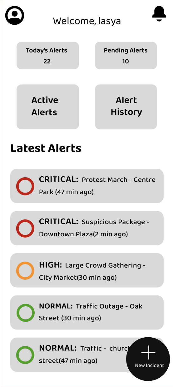
1. Simplified Reporting Through a Floating Action Button
A prominent "New Incident" floating action button was added to allow users to quickly create reports.
The reporting flow needed to be immediately visible and accessible during urgent situations. Reducing friction was more important than hiding actions inside menus.
2. Severity-Based Alert Prioritization
Alerts were categorized using visual severity indicators.
- →Critical
- →High
- →Normal
Authorities need to identify urgent incidents at a glance. Visual prioritization reduces scanning time and helps users focus on the most important alerts first.
3. Card-Based Alert Dashboard
Incident reports were displayed using clear cards containing essential information.
Cards improve readability on mobile screens and make multiple reports easier to scan quickly without overwhelming users.
4. Mobile-First Interface
The entire experience was designed for mobile devices.
Authorities may need to access alerts while on the move rather than from a fixed workstation. A mobile-first approach supports faster response and accessibility.
Future Scope
CCTV-Based Automatic Detection
The original concept of Capture Alert relied on CCTV footage to automatically detect unusual crowd gatherings and generate alerts without requiring manual reporting.
This would reduce reporting delays and improve response speed.
Live Incident Tracking
Authorities could track ongoing incidents, monitor status updates, and coordinate responses in real time.
Learnings
- Clear information hierarchy becomes critical in emergency-focused products.
- Color, spacing, and layout directly influence how quickly users understand information.
- Simplicity often matters more than visual complexity when designing for urgent situations.
- Designing for action and speed requires different priorities than designing social or content-based products.
A quick walk through the interface.
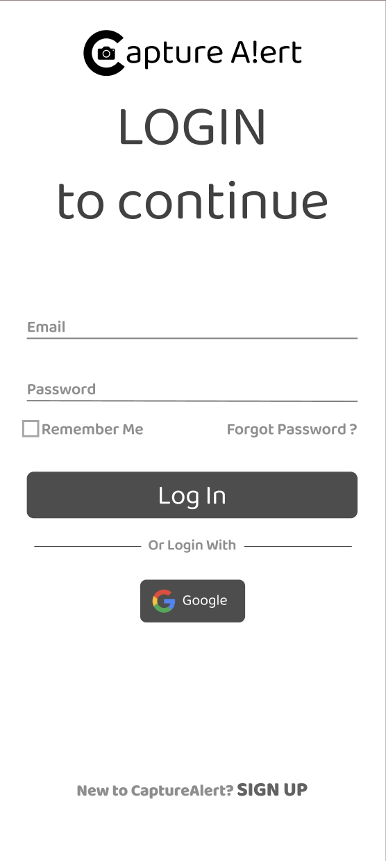
Login
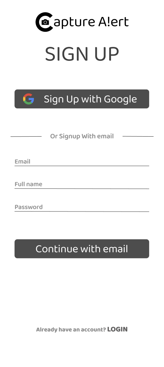
Sign Up
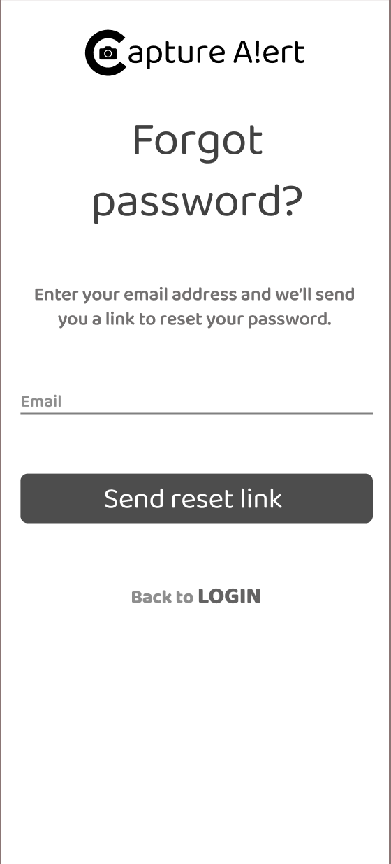
Forgot Password
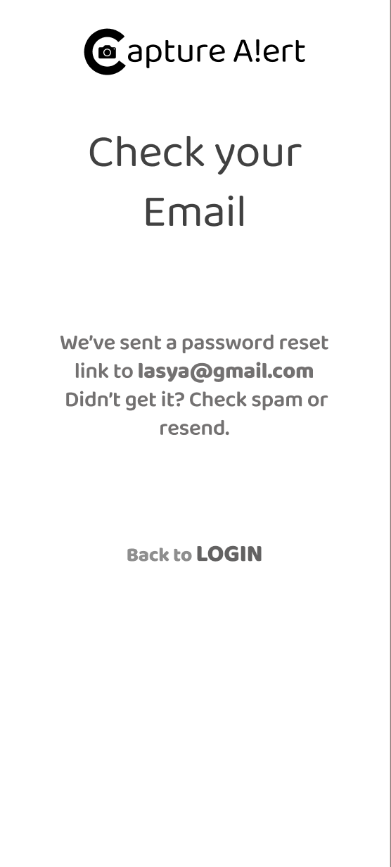
Email Confirmation
Main Dashboard